Raveland Packaging
After designing a batch of sticker designs for Raveland, a music festival clothing company, my client came back to me looking to incorporate those designs into new PR packaging. The challenge was to create two distinct boxes (and later shopping bags) using the same illustrations. Raveland asked that Box Design One be “edgy, fun, and seamless” while Box Design Two focused on a playful rainbow color scheme.
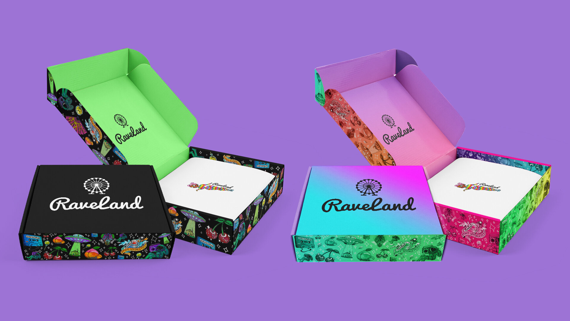

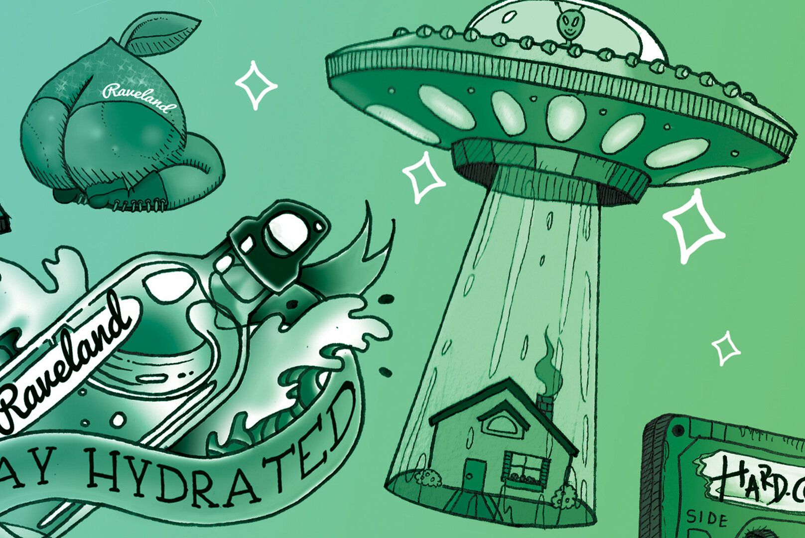
Close up of Box Design 1’s illustrations. Each illustration was originally created as an individual sticker design.

An all-black exterior was selected for Box Design One to achieve the client’s request of a “seamless” appearance. The original color of the illustrations also popped against the dark background. A neon green interior with a contrasting black logo adds an element of excitement for the recipient as they open their package.
We also adapted a matching shopping bag design from Box Design One.

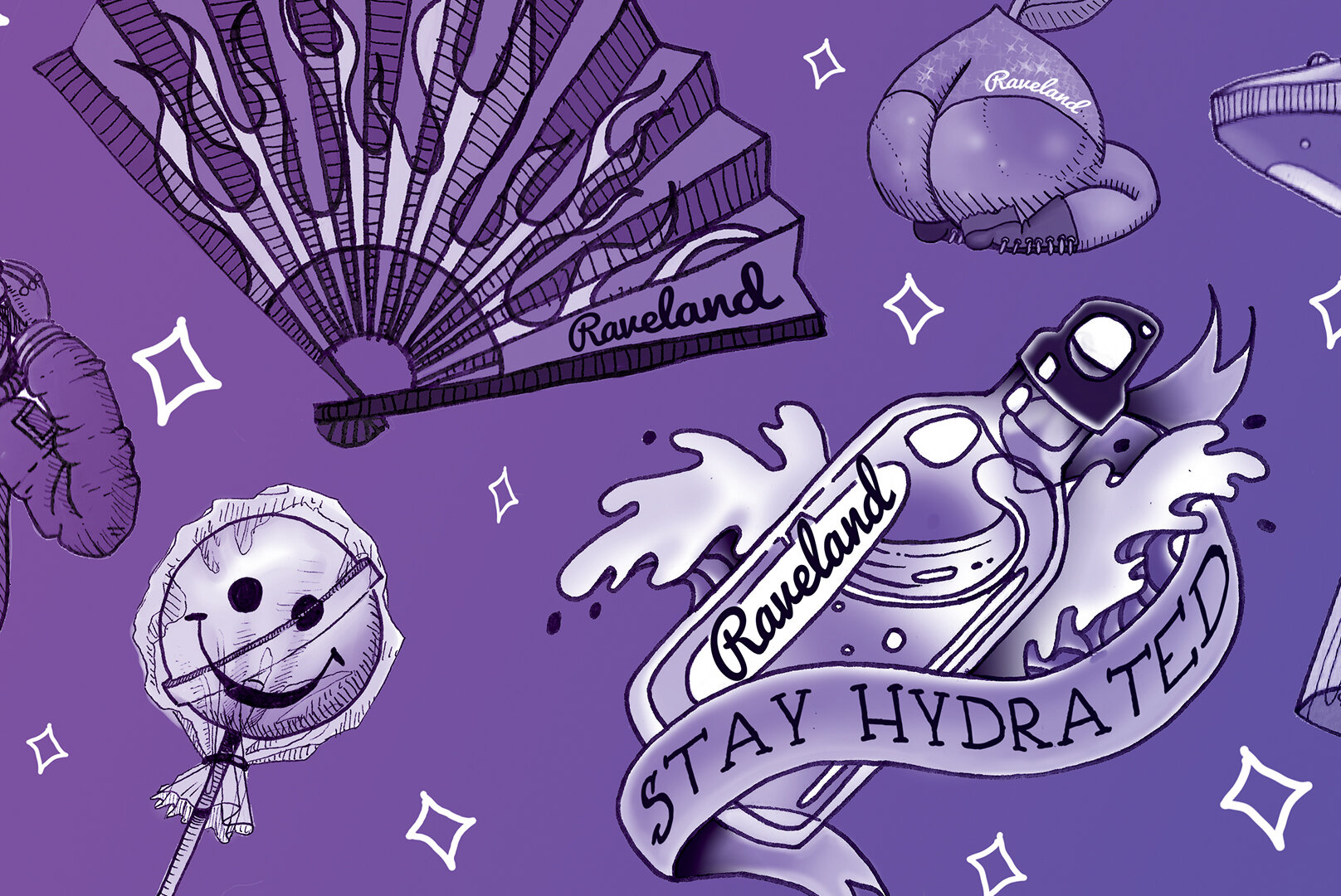
Box Design Two

Color Delivered.
To compliment it’s darker counter part, Box Design Two features a variety of colorful gradients along every panel of the box.